Super-people
Live Client experience
This brief was to create A5 greeting cards to help super-people clients, - super-people are an organisation that helps disabled/neurodivergent individuals find work. - Professionalism, adaptability and live client experiences were the main aspects of this project.
Planning
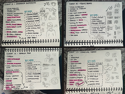
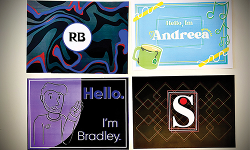
After discussing with my group we liked the idea of having a d&d design for client 15 as well as a simple illustration design for client 16, then have client 17 more of a corperate design keeping to the professional and geometric style, then for client 3 we all agreed that it needed to be a playful bright design to suit her personality. I also went on to draw some logo’s/ icons as well as some avatars for clients that asked. I made a key idea section to make it easier to design their cards, and also highlighted important factors.
First Designs
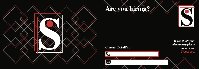
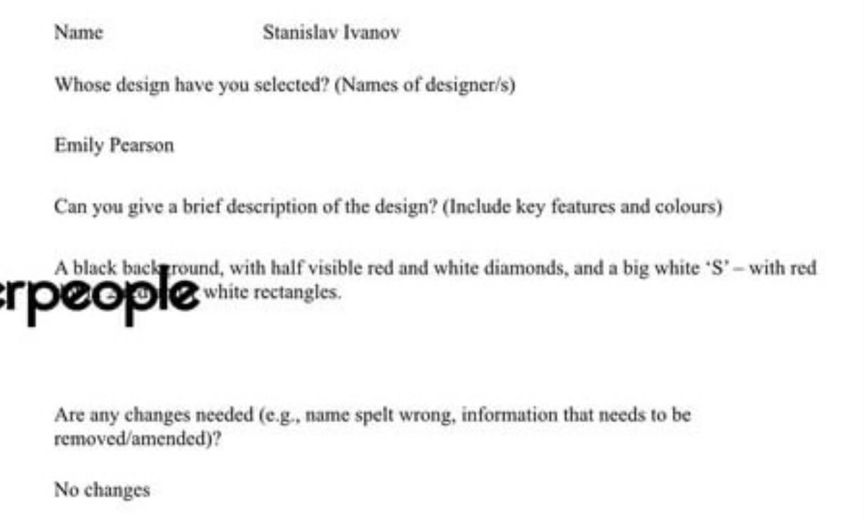
From what I read client 17 wanted a professional/corperate style card and so I chose to design this with the colours he asked as well as some geometric elements to blend with the serif font, creating a slik design. Jake - head of super-people - agreed that this design would suit the client best and was chosen to show at the client meet.
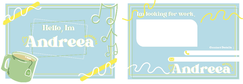
Client 3 stood out to be bright and playful so I want- ed to show that in her design using the colours she asked and illustrative design elements that relate to her, to create a very clean and vibrent design. Jake agreed that this design would work best and to show at the client meet.
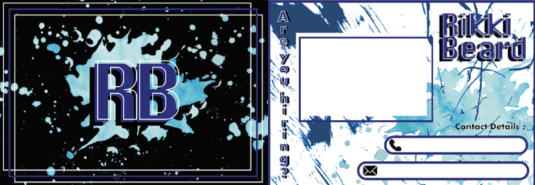
Client 15 mentioned that he liked D&D so I tryed to use textures and elements that could relate to the game with still keeping the colour blue that he asked as well as space for his details. This design wasn’t chosen as Jake felt that my group member Amy’s design would work best as did I.
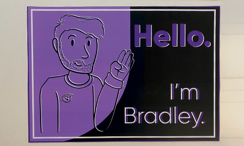
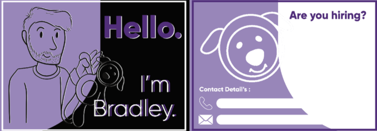
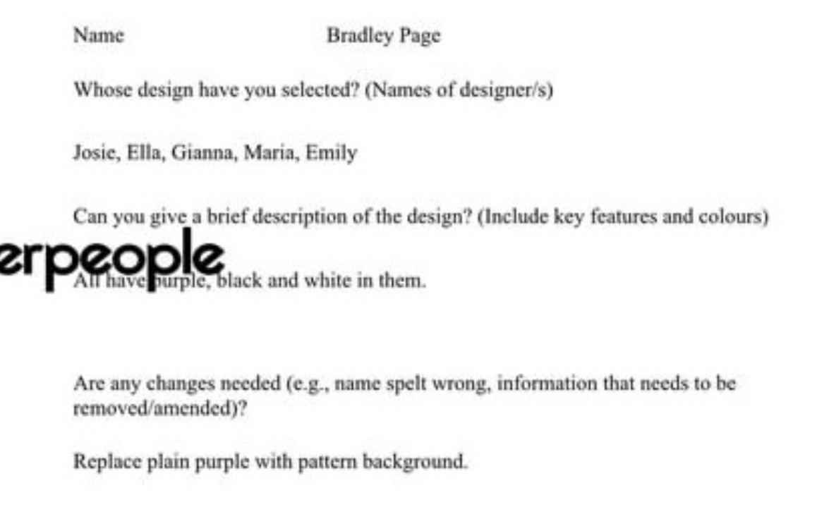
Client 16 came across as friendly and profes- sional so I wanted to keep the design simple yet playful to express his personality and give him a chance for others to be more understanding, which is why I decided to include his plush but also knew that this needed to stay profession- al so made the avatar stand out on the purple while the plush was then made the second visual element. However, myself and Jake agreed that it would be more professional if the plush was removed and put onto his jumper as a symbol.ƒ
Final Designs
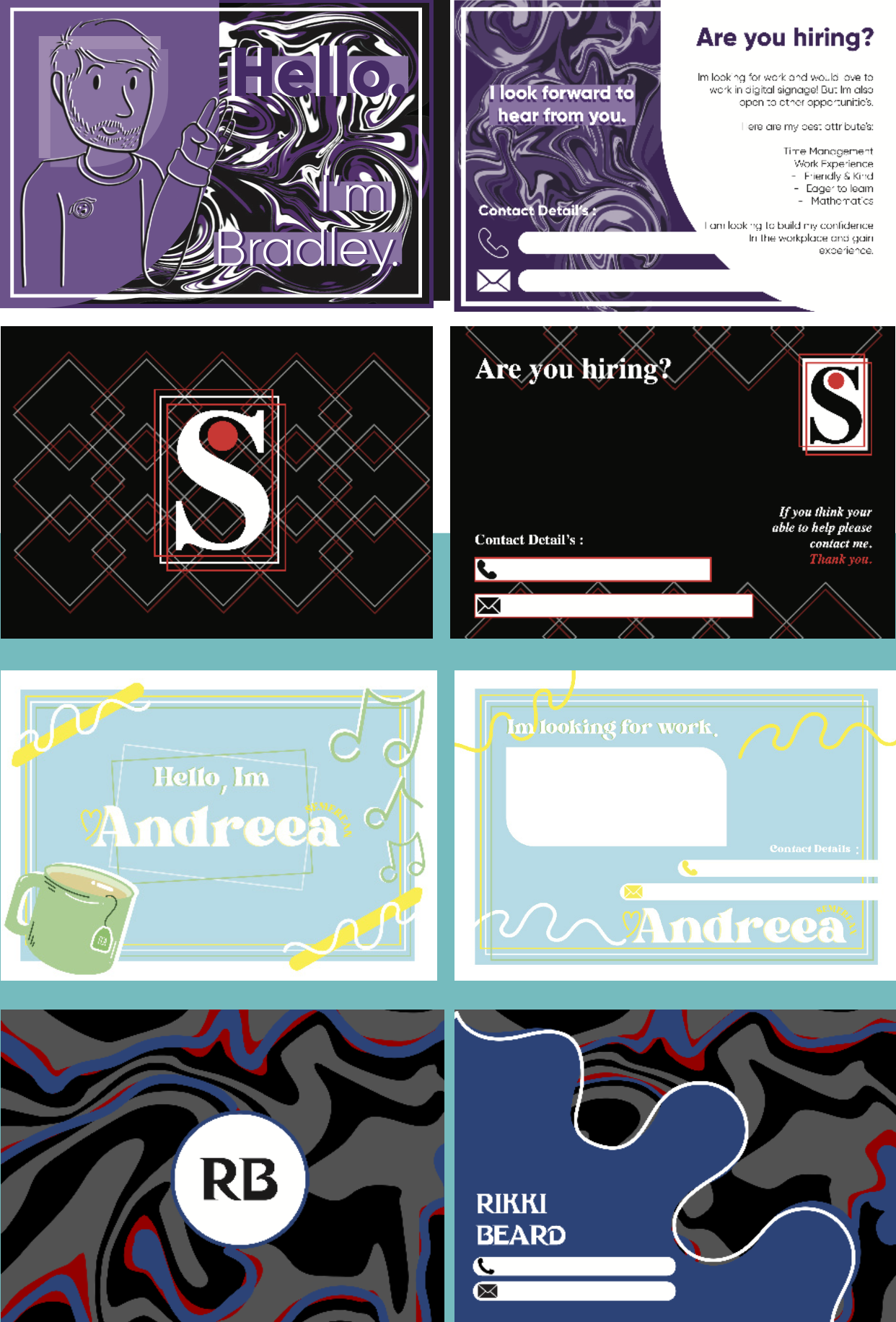
The client meet was successful and two out of the four designs were chosen by the client which makes the whole experience rewarding as it shows that I was able to design what they wanted. After asking the clients questions, client 16 asked If the hair on the avatar could be tweaked to suit his hair cut which I did right away, he also asked to have a liquify style instead of the plain purple shape which I would then go on to try to change this but the avatar would not stand out and so I decided to do this for the background instead. Client 17 wanted no changes and really liked the design because it was professional and used his colours.
Feedback
It was great to be able to talk to a live client in person as I was able to recieve first hand feedback as well as ideas that I would’nt have thought of. I would also say that this is benefical for them and myself as I was then able to personalise their card even more to suit their needs. I felt quite proud of myself with this client as out of three designs they had to choose from they chose mine by name which as a designer encourages me to follow my ideas and continue to love branding! Not only does feedback help but it can also build confidence.